Custom elements, shadow DOM and implicit form submission
April 20, 2019 • ⏱ 5 min readWhen building forms in regular old HTML, we´re used to the form automatically picking up our inputs and buttons.
Posting our form will include all named inputs, and the default button will implicitly submit the form.
Your typical framework might have some extra utilities to handle things like validation or form submitting, but the basic HTML structure is pretty much the same.
Encapsulating a native button inside a custom element
Custom elements gives us the ability to register new elements with the DOM that plays nice with both frameworks and regular HTML. These elements usually encapsulate markup and add functionality that you wouldn´t find in normal elements.
This itself is pretty cool, as we´re not relying on the HTML spec to include components like date pickers, multi selects or popovers.
You can read a lot more about the API´s that make up Web Components right here.
Let´s try and put a native <button> element inside a custom element:
import { Component } from '@stencil/core';

@Component({
    tag: 'my-custom-button'
})
export class MyCustomButton {
    render() {
        return (
            <button>
                <slot />
            </button>
        );
    }
}
I´m using stencil, a web component compiler, in my examples
The component is extremely simple and just renders a native button while passing in content to the <slot> inside the native button tags.
Stencil defaults to not using shadow DOM when building components and therefore our component above does not hide away any of its internals.
One of the benefits of shadow DOM is native encapsulation. Styles cannot bleed in from the outside, and styles inside our component cannot leak out.
Using our newly created custom button within a form looks something like:
<form action="#">
    <input type="text" name="name">
    <input type="password" name="password">
    <my-custom-button>Login</my-custom-button></form>
When the browser renders our custom element, the output of our render function will be rendered in the light DOM inside our custom element tag:
    <my-custom-button>
        <button>Login</button>    </my-custom-button>
There we go! The form is submitted when we click our button! 💪 This works due to implicit form submission.
Implicit form submission: A form element’s default button is the first submit button in tree order whose form owner is that form element.
Adding a little shadow DOM to the bowl 🥣
Lets make our button a little more advanced by adding some more markup and activating shadow DOM on our component:
import { Component } from '@stencil/core';

@Component({
    tag: 'my-custom-button',
    styleUrl: './my-custom-button.css',
    shadow: true})
export class MyCustomButton {
    render() {
        return (
            <button>                <span class="button-inner">                    <slot name="start" />                    <slot />                    <slot name="end" />                </span>            </button>        );
    }
}
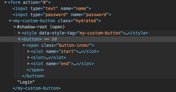
Let´s take a look at what the DOM looks like after we´ve added shadow DOM.
The image shows that our component output now contains a shadow-root. If we expand this, the internals are revealed in the web inspector:
If we click our custom button now, nothing will happen.
But why? 🤷🏻
The short explanation is; elements inside the shadow-root are not in tree order.
This also applies to all input elements inside a shadow-root. These will not be picked up by a parent form.
Well that´s a bummer 😣. Does this mean that we should stop using custom elements for anything form related? No! I think not.
While it does add a little more friction, It´s not unsolvable.
Fixing implicit form submission on our custom button 🔧
One way to fix our issue above is to simply not use shadow DOM. This would put our components innerHTML into the light DOM and everything just works.
However, that’s not what we want at all. We use shadow DOM for a reason, right?
That reason being that sweet sweet encapsulation. Making sure our components works and looks just like we want them to.
So let´s look at how we can make our custom button work. In order for our form to submit, we need a submit button in tree order.
Let´s add some functionality to our existing component:
import { Component, Element, Listen } from '@stencil/core';

@Component({
    tag: 'my-custom-button',
    styleUrl: './my-custom-button.css',
    shadow: true
})
export class MyCustomButton {
    @Element() el;
    @Listen('click')    onClick(event: Event) {        const form = this.el.closest('form');        if (form) {            event.preventDefault();            const fakeSubmit = document.createElement('button');            fakeSubmit.type = 'submit';            fakeSubmit.style.display = 'none';            form.appendChild(fakeSubmit);            fakeSubmit.click();            fakeSubmit.remove();        }    }
    render() {
        ...
    }
}
We´ve added two decorators and a method. Lets quickly go over the decorators:
- The
@Element()decorator is used to get a reference to thehostelement - The
@Listen()decorator is used to set up eventListeners, in our case we want to listen forclick
Stencil uses a range of decorators at compile time to collect metadata about your component, its properties, attributes, event listeners and much more.
Looking at our onClick method we query the dom for the closest form element using element.closest().
If a form exists we create a fake button element, set its type and style attribute before appending it to the parent form.
We then click it and immediately remove it from the DOM again.
And there we have it 👌
It is not the most elegant solution and there might be a better way of doing it, but it does makes our custom button submit our form.
We could further enhance our component by having the developer choose if the button is indeed a submit button or a regular button, but that´s outside the scope of this article.
Now what about inputs 🧐
Dealing with input elements inside shadow DOM also has its limitations and workarounds which we will explore in future posts.

